USE Software 2026 Rebrand
A production-quality marketing website and collateral suite for a Queensland-based technology consultancy, built around a full brand refresh, hi-fidelity Figma prototyping, and a Next.js + Chakra UI v3 implementation.
Design systems & theming
Research-driven UX
Accessible, performant UI
6 min read · 3 Feb 2026
The Mission
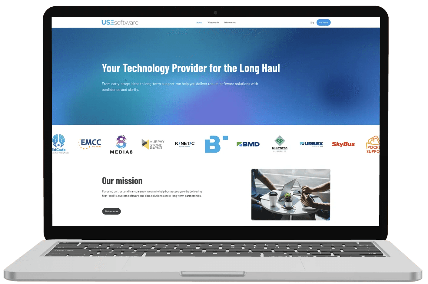
I led the complete rebrand of USE Software—a Queensland-based technology consultancy—from market research through design, development, and sales collateral. The goal was to position them as a modern, trustworthy partner in a crowded market while delivering a performant, scalable web presence that reflects their technical capabilities.
Quick Specs
Role: Lead Frontend Developer & Product Designer
Tech Stack: Next.js (Pages Router), TypeScript, Chakra UI v3, Framer Motion, Figma
Timeline: 6 weeks from research to launch
Key Outcomes:
- 95+ Lighthouse scores across all metrics (Performance, Accessibility, SEO)
- Unified design system spanning web and print collateral
- Research-driven information architecture and competitive positioning
- CMS-like content architecture for non-technical team updates
The Challenge
Technology consultancies in South East Queensland face a credibility problem. Most sites rely on jargon-heavy copy, generic stock imagery, and unclear service descriptions. For a boutique consultancy like USE Software, this creates an opportunity: stand out by being clear, human, and outcome-focused.
The team needed a brand refresh that would:
- Position them as approachable experts, not faceless enterprise consultants
- Clearly communicate their two engagement models (Project vs. Provider)
- Support sales conversations with cohesive collateral
- Demonstrate technical capability through the site itself
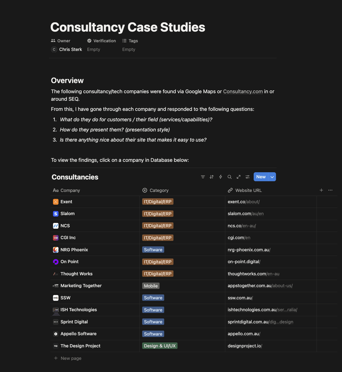
Strategy & Insights: Finding the Gap
I researched 20+ local and international technology consultancies using a structured framework, analysing what they do, how they present it, and what makes their sites easy or hard to use. Each competitor was catalogued in Notion with detailed notes.
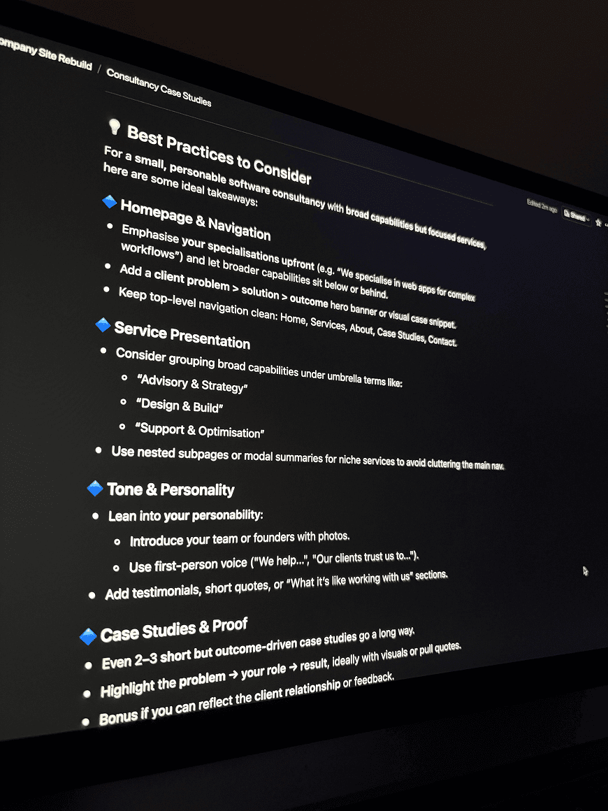
What Works (The Do's)
- Clear service articulation with outcome-focused language
- Trust signals upfront (client logos, case studies, certifications)
- Humanised brands (team profiles, values, culture)
- Strong information hierarchy with predictable navigation
- Mobile-first UX with scannable sections and strategic CTAs
What Fails (The Don'ts)
- Jargon-heavy corporate speak ("synergise", "leverage", "optimise")
- Unclear entry points and confusing navigation
- Generic stock imagery that undermines credibility
- Weak mobile experiences and poor visual hierarchy
- Lack of real outcomes or client stories
Strategic Positioning
This research became my design brief: USE Software needed to be the approachable alternative—clear where others are vague, human where others are corporate, and outcome-driven where others rely on buzzwords.
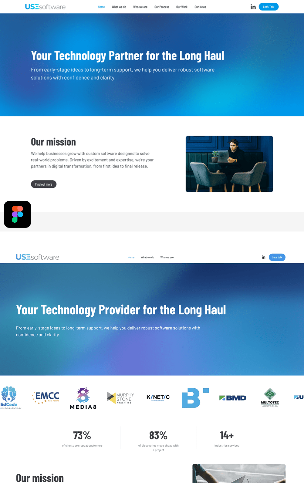
From Canvas to Code: The Design System
Inspired by high-end narrative patterns, I implemented a scroll-based journey that guides visitors from problem through solution to contact.
Figma to Final Build
Every page was prototyped pixel-perfect in Figma before a single line of code was written. I iterated through agile sprints with stakeholders to ensure 100% alignment, reducing downstream rework.
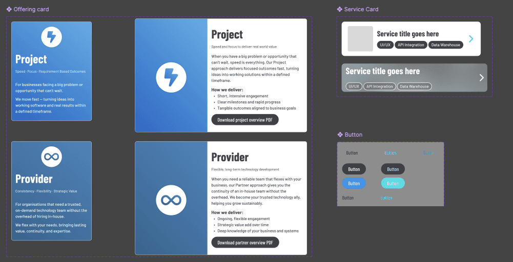
The design system uses Chakra UI v3's token architecture as a "Lego brick" approach:
| Layer | Purpose | Example |
|---|---|---|
| Design Tokens | Brand foundations | Colour scales, Barlow/Barlow Condensed fonts, animation presets |
| Text Styles | Responsive typography | `heading/section`, `heading/sub-section` with breakpoint scaling |
| Component Recipes | Reusable patterns | Section layouts, card variants, form fields with slot-based styling |
This architecture mirrors the Figma component library, ensuring pixel-perfect translation from design to code while maintaining scalability.
Content-Driven Architecture
Pages are composed from structured configuration objects—functioning like a website builder's CMS. Non-technical team members can update copy, metadata, and imagery by editing simple config files without touching layout code.
Interactive Motion: The Show-Stopping Hero
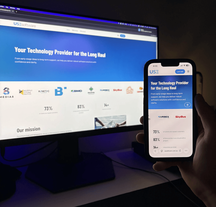
When potential clients land via Google search, they're greeted with a seamless animated hero that immediately demonstrates USE Software's capability to design impactful UI/UX.
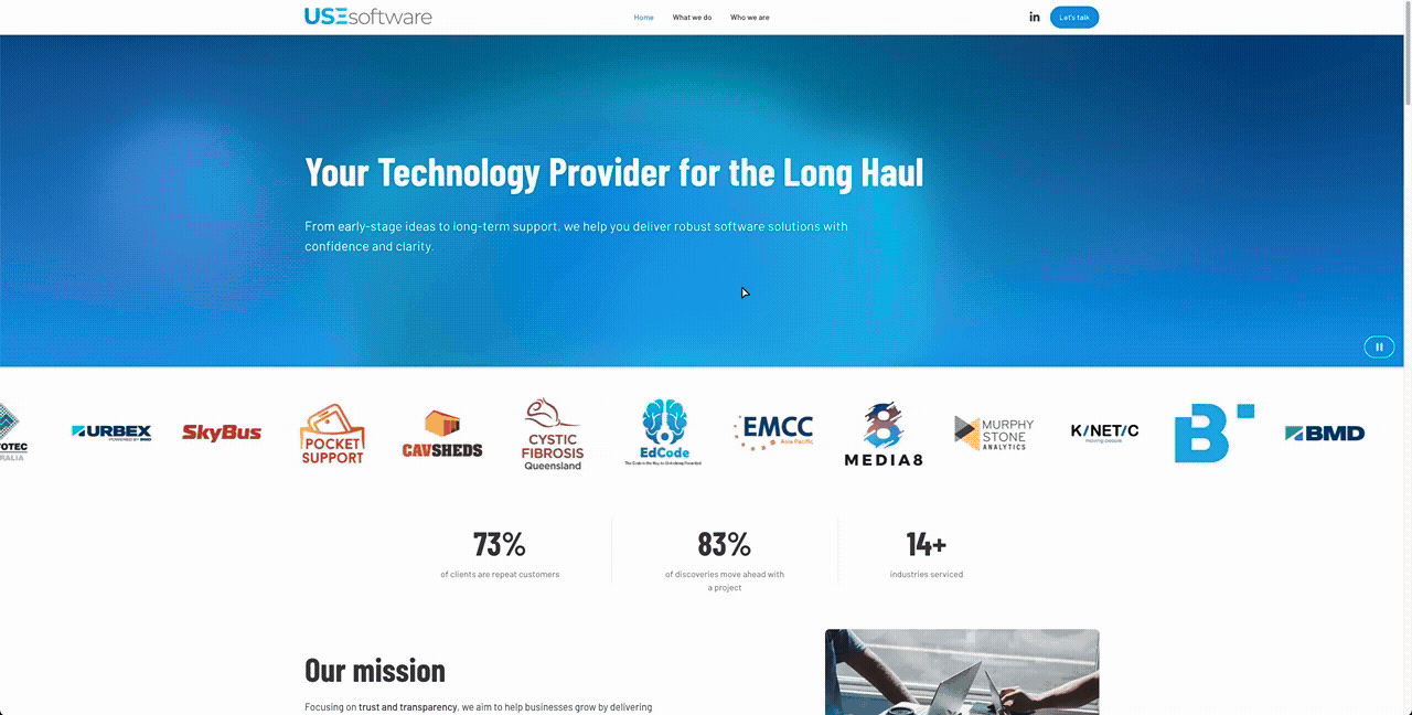
Scroll-Based Storytelling
Each section uses a custom Intersection Observer hook to trigger staggered entrance animations—titles slide up, content fades in with subtle delays, creating a controlled reveal that mirrors high-end narrative design patterns.
The "Our Process" section presents a scroll-driven progress journey: as visitors move down the page, each of the six steps highlights in sequence with a progress indicator, giving a clear sense of the engagement flow from first conversation through delivery.
Accessibility First
Animation preferences are saved site-wide. Users who prefer reduced motion can pause animations once, and their preference persists across all pages and future visits.
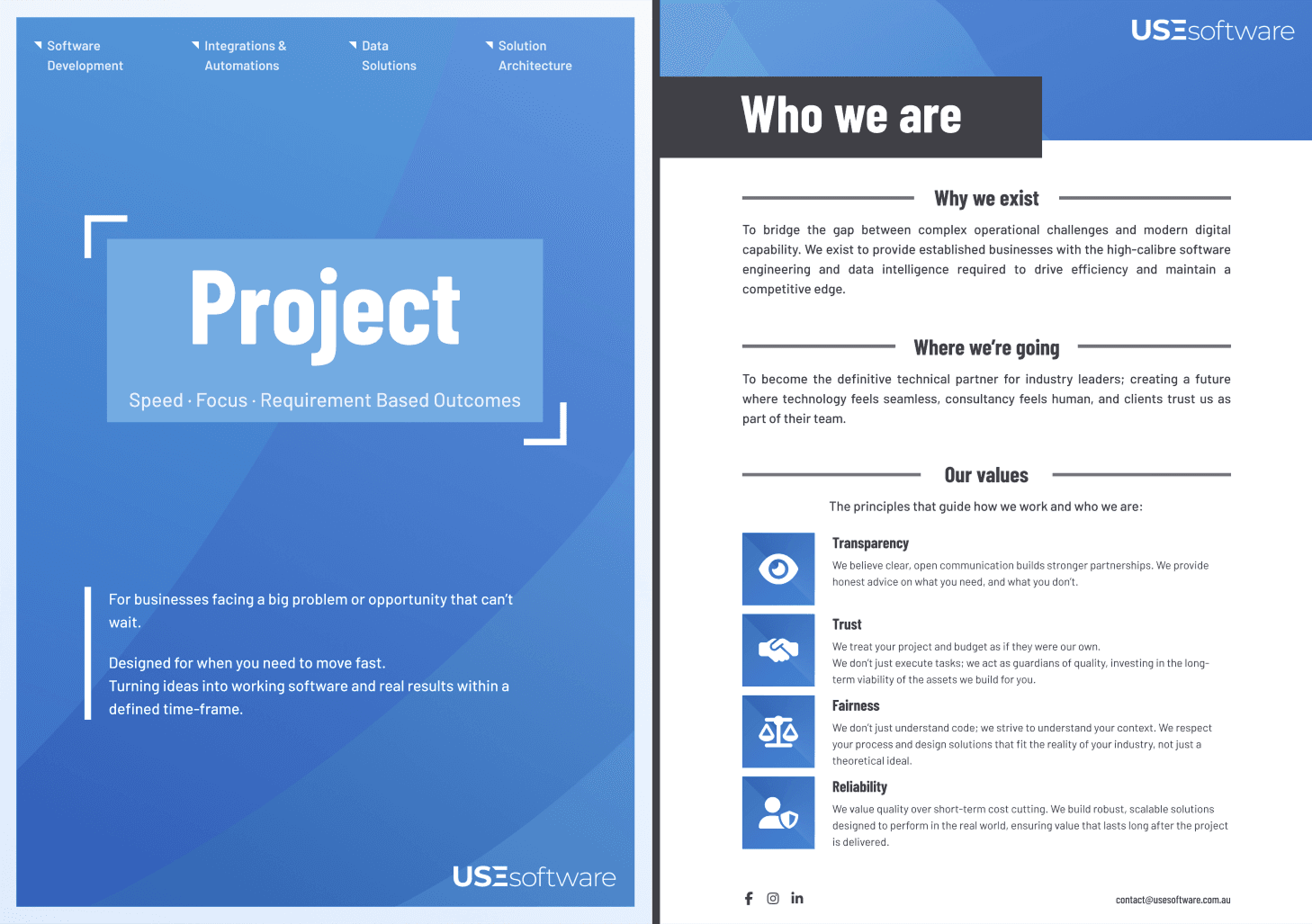
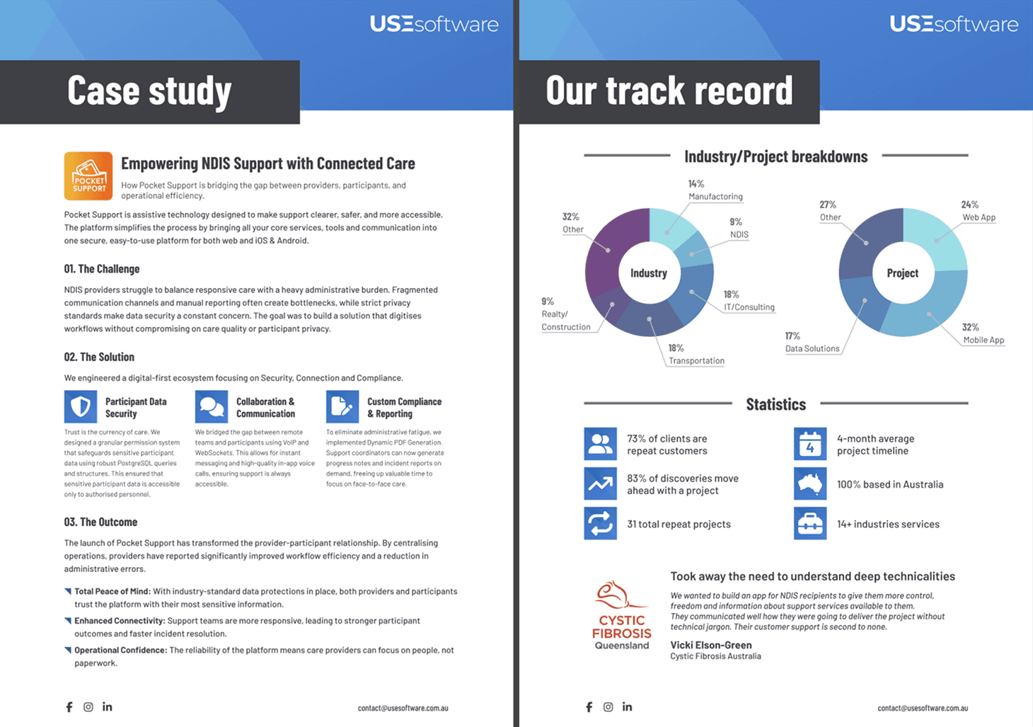
Beyond the Web: Unified Brand Collateral
The rebrand extended beyond the website to Project and Provider brochures—PDF collateral supporting sales conversations.
Extending the Design System to Print
Both brochures were designed in the same Figma file using identical tokens (fonts, colours, grids, iconography), ensuring they feel like a natural extension of the website whether viewed digitally or printed.
Collaborative Content Development
Copy and messaging were developed collaboratively:
- Chris (me): Narrative structure, mission/values framing, and CTAs aligned with brand voice
- Josh (Principal Software Consultant): Capabilities, services, and delivery methodologies
- Sam (Principal Data Engineer): Problem statements, pain points, and solution/benefits grounding
This division of ownership ensured the brochures reflected actual capabilities and methodologies, not generic marketing language.
Purpose & Strategy
- Project Brochure: Positions time-bound, outcome-driven engagements (MVPs, features, prototypes)
- Provider Brochure: Frames USE Software as a long-term technology partner for ongoing, flexible support
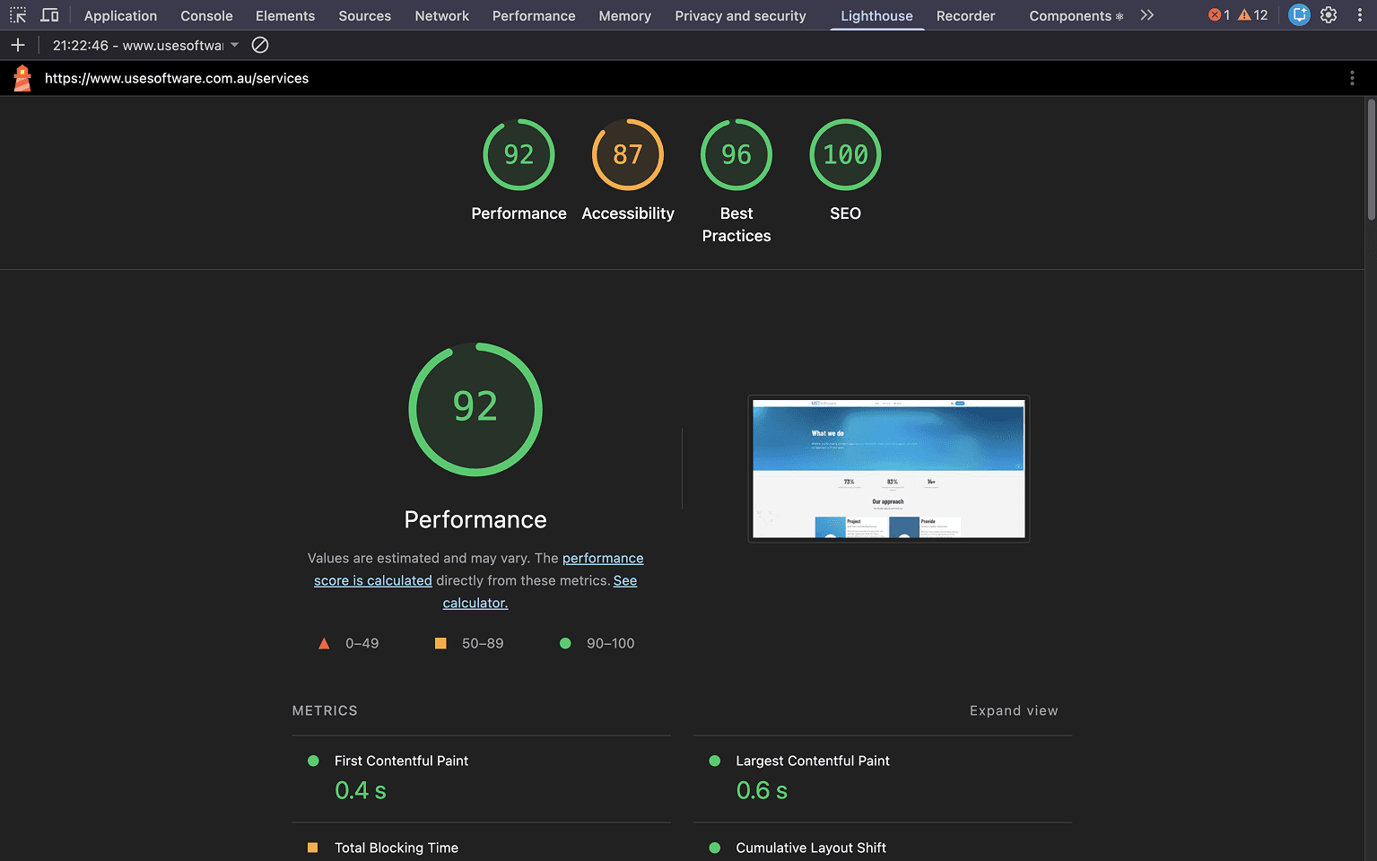
Performance & Results
Lighthouse Scores: 92%+ Across Performance, SEO, & Best Practices
Throughout development, I monitored and optimised for:
- Performance: 92%+ with fast LCP (Largest Contentful Paint)
- Accessibility: 87%+ ensuring assistive technology support
- SEO: 100%+ with structured data, semantic metadata, and local optimisation
- Best Practices: 96%+ modern web standards compliance
Technical Implementation Highlights
- Atomic design architecture: Reusable atoms, molecules, and organisms for maintainable, scalable code
- SEO architecture: Content-driven metadata system with Open Graph, structured data (JSON-LD), and local business optimisation for Queensland-based searches
- Analytics integration: Google Analytics and Hotjar for data-driven iteration post-launch
- Image optimisation: Next.js Image with priority loading, explicit dimensions, and meaningful alt text
Reflections
What I Learned
This project reinforced that starting with research changes everything. Understanding the competitive landscape shaped every decision—from navigation labels to motion design to brochure messaging.
What Sets This Apart
Most frontend developers don't show print/PDF work. Extending the design system to sales collateral demonstrates I think like a Product Designer, not just a developer who implements specs.
The Chakra UI v3 token system proved to be the ideal "Lego brick" approach—centralising styling while keeping components composable and maintainable. Combined with the CMS-like content architecture, the site is future-proof: the team can iterate on copy and imagery without destabilising layouts.
Why It Matters
This case study showcases a full-stack rebrand process: research-led strategy, cross-media design systems, and robust implementation. It's not just a website; it's a cohesive brand experience that positions USE Software exactly where they need to be—approachable, trustworthy, and technically capable.